
Sometime, last year, or the year before that, I bought some of Stuart Semple’s Pinkest Pink. I recall I purchased some Potion, and well, the pink was on sale. I also picked up some Diamond Dust at the time. Like most artists, I just buy things on a whim without any thoughts over what I’m going to use them for. I don’t draw with pink. I certainly don’t even do any physical painting either, it’s mostly all digital. What the heck would I use this for?
I did eventually use the Diamond Dust for a piece which immediately sold as soon as I put it up. Diamond Dust is actually really dangerous — it’s itty bitty flecks of glass, rather than plastic bits or cutouts like conventional glitter. It’s a neat effect, but also requires you to use gloves, keep an extremely clean workstation (especially if you have pets or kids) and of course never touch your eyes. I’m wary of continuing to use it just because the hazards are so very present, but that’s another story for a different blog post.
Anyway, so after using the Diamond Dust, and using the Blackest Black, and then briefly using Potion, Pink sat with my acrylic paints for a long long time, not even opened.
Until, this year, I determined a use. I would use it in my work “Role”.
Brief sidebar…
Role, aka Gender Role
There’s this constant echo I hear regarding some, if not most of my works. I draw a lot of men, most specifically, I draw a lot of my original character Azra. He’s an openly bisexual man with nothing to prove to anyone about who he is or where his passions lie. The echo comes from family members who, as soon as they see me decorating him in jewelry, as in Starboy — especially given it’s pink jewelry — or showing his bum like in Umbra, they like to ask: “Is he gay or something?”
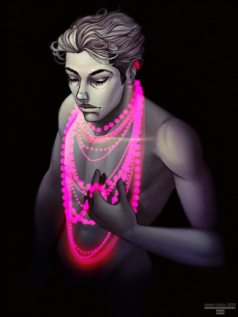
I am constantly bombarded with probably well meaning family members who do not understand the illustrations, the character within, and the message, who confuse colors and gender stereotypes with sexual orientation and preference. I am asked questions like, “why are you constantly drawing nude men?” and “Why don’t you draw some women?” or told I cannot send out to my family members a Christmas card featuring two men performing Christmas traditions.

I am certain my family members do not mean harm, they just don’t understand. They don’t understand that there are more people in the world than just the status quo — that people who don’t care about gendered stereotypes like who should wear pink exist in the world, and we’re not just talking about rock stars and hip hop artists (Starboy was based on The Weeknd’s track “Starboy”, and the music video features high contrast beautiful color complements of aqua and you guessed it, bright pink), and that gay people, non-binary people, bisexual, pansexual, and all colors of the rainbow do exist.
Flatly, evenly — it’s just what I like to draw.
Azra himself is unapologetically both a tough guy and a sensitive one. He is featured in works sporting a bloodied nose and black eye, with wrapped hands from street fighting, and conversely also drawn wearing a lovely, sparkling outfit while performing as a swan prince during a gender-swapped Swan Lake ballet performance. Or wearing nothing at all. He is not ashamed of himself, his body, what he chooses to wear or feel, or his preference in partner, whoever it may be. And why should he be?
Pink as a Powdered Pigment
Anyway, back to the pink…
I remember when I received the pink I was a bit disappointed with what it looked like. The baby pink powder I found inside of the jar did not seem to look too “pink” to me, how could it be the pinkest pink? This might have been some of the reason that it sat for so long at the back of my art supply cabinet.
But I want to tell you that the pink, as a powdered pigment, is wholly deceiving. I decided to use the pink as a background, and after gessoing a canvas I had, I mixed up the pink powder with some water. Once water hit it, damn, there was the pinkest pink I was promised. That pink was damned near electric. It’s probably the absolute closest you could come to being backlit without actually backlighting anything.
The photo does not do the level of pink justice. It is damned near impossible to photograph well, as the pink just seems to glow. Additionally, Pink is blacklight reactive, meaning yes, it glows under a blacklight.
Pink with Water
I mixed the pink with water to develop this base background color, and ended up using the majority of the pink. It actually mixes quite well with water and dissolves evenly with the water. However, I must’ve done a poor job mixing at some point because I had smears of lighter pink here and there. The gesso underneath was completely dry given I gessoed the canvas months ago and put it aside, so I can confirm it wasn’t that. I decided to do a second layer of pink to even it out.
I used up most of my 50g of Pink this way, and dried it with a hair dryer (I was being impatient, I admit). This caused the pink to pucker up, which actually gave a really interesting scale effect. Since I wasn’t going to sand it down and start over, I kept it.
Can confirm Pink mixes well with water, and makes a good background color.
Pink with Linseed Oil
I started my drawing with a digital composition, laid down colors in acrylic, and knew I was going to work with oil paints for the remainder. That meant I had to work the Pink into some sort of oily base. I picked up a few things at the store. I grabbed refined linseed oil, and galkyd. I also had gamsol on hand already, so I could play with all of these things.
When it came time to try to add some more pinky parts around the work, I mixed with linseed oil first. I can tell you I was not happy with the outcome. The linseed oil mixture was extremely lumpy, no matter how I mixed it. I wouldn’t suggest just using linseed oil unless maybe you sift it first? I abandoned the idea of the linseed oil.
Can confirm Pink + linseed oil = lumpy paint.
Pink with Oil Paint
From there I thought, well, maybe if I just mix with some white. I thought I could use the linseed oil mixture as a glaze, since it was not opaque by any means. I could start with a base that was pink-ish, and then just add layers of glaze to get to the pink I wanted. The pink didn’t mix well with the standard Gamblin white I had either — still lumpy.
Can confirm Pink + oil paint = lumpy paint.
Pink with Galkyd
After lumping up my painting quite well, I finally tried just jumping over using a mixture of linseed oil + oil paint + galkyd and went straight into mixing with galkyd. Originally, I was using the galkyd with my whites and other oil paints to speed up drying so I could do more thin layers. When I moved to mix Pink with galkyd, I found it was a lot more successful at mixing or even creating a glaze than the linseed oil. The only downfall is if you plan to work with it after 24 hours, you’ll have to remix it. But it was the least lumpy of the bunch, next to mixing with water.
I actually determined laying down the thing I wanted pink, then glazing over bit by bit with the galkyd mix was the best solution. I could even get fully opaque with enough layers.
Can confirm Pink + galkyd = less lumpy glaze.
Pink with Gamsol
I never mixed straight with Gamsol, so I can’t say if this is the least lumpy of oil paint alternatives, but I did use it to thin, and it worked fine when thinned with Gamsol. Pink also washed off brushes the same way any other pigment would.
It also retained its blacklight sensitivities…
My big tl;dr takeaway on the pink is buy more than you need, and use it as a glaze rather than expecting to get any sort of opaque pigment out of it. I do think Pink would probably do well as a watercolor pigment as well. That could be fun!
Finally, I finished off the painting with a protective coat of Gamvar. With enough coats, it will make the whole thing glossy rather than just the galkyd spots. Gamvar is a non-yellowing brush applied varnish for UV protection for your paintings. It also allows oil paint to dry beneath the varnish, meaning you only have to wait until the painting is dry to the touch to varnish, rather than dry completely through. It’s available in gloss, satin, and matte, though I’ve only ever used it in gloss. I love Gamvar and would highly recommend it.

Purchase links, in case you want any of these things:
One thought on ““Role” In Progress, Pinkest Pink Review”
Comments are closed.