You’ve probably by now seen a lot of my in progress shots and how the works are created. I wanted to go a little more in depth and talk about some of the technical aspects of creating a work such as this one.
Here’s the completed work, for reference of course:

There were a few things I wanted to accomplish with this work. I wanted to address a starkness of white flowers in a meadow, across a field of bushes and bushes of them. The original idea was based upon this thought of my original character Azra‘s favorite flower being chamomile (kamille in German), which grows wild in Germany. I figured, there’s probably a reason, as with most things in his life, that chamomile is his favorite flower in specific. He mentions more than once that he has a cheap reproduction of a painting by Gustav Klimt in his condo — “Tannenwald I” — and he notes something about the small implications of white flowers in the lower right corner; there is something strangely off putting about that painting that he feels says a lot about home, to him. He must have run across the fragrant blossom more than once in his travels. I drew him in a specific time period — after he’s run from his home, lost his wings, looking fragile and frail, but still trying to make his life work. I chose to give him his short hair here even though he may have still had his long hair at this point (albeit in patches from pulling due to trichotillomania), although it’s not impossible that he could have begun to cut down the rest of it to his hair to match. It’s questionable whether he has hurt someone or something, or if he is hurt himself, but that’s the uncertainty of the illustration. He’s fallen to his knees in this field after this violence, it’s up to the viewer to decide who it’s in favor of.
Working on it above, you can see where I toyed with the idea of his long hair.
An illustration such as this one poses a lot of technical questions. As a digital artist, I look for ways to get around tedious hand drawing. Since digital art makes it easy to replicate and create things in a quick manner, I had to figure out how to do this and how to do it in a way that was believable to the eye. Often times, amateur digital artists when replicating ideas forget about patterning and how it can throw off an illustration if not purposely regarded when starting the piece.
I wanted to give this work a slightly more polished version of my character cards. I’ve been doing things a little more simplistic lately, as they take less time to create and can often times come out better than pouring a lot of time and effort into detailing every single thing as I am wont to do. Instead, I am trying to focus on putting effort into details that matter — like Azra and his bloodied hands and bloody mouth, here.
So here’s the question: How do I create all of those little chamomile wildflowers while making it look convincing?
First, I started with the very back row bordering the forest. I worked a little hand drawing every single little flower in the back. It wasn’t too difficult given that at that distance, it would be hard to tell a flower from a circle, so drawing blurred up asterisks was one way. Even then, though, it took up a lot of time and would get even more time consuming when I started towards the foreground.
There’s a pretty easy solution here I often use. That solution is: make some brushes!
I had some leftover brushes I had created when I made this work:
I also used the brush in Our Names In Lights. So I had a good basis for a meadow, but only stuff that can fluff up in areas. I didn’t have anything long enough to emulate a chamomile stock, so of course I had to make something. Most of my brushes are created out of necessity for that sort of thing, so it’s no wonder how many I have.
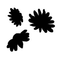
First I started by drawing up some flower heads. Chamomile is a white daisy-esque looking flower with a yellow cone in the middle. Unfortunately Photoshop is limited to black and white brushes (or single color brushes) so I could only make the general shape of it and then define the brush, but no matter. I’ve done this before! Here are some of the flower heads I created:
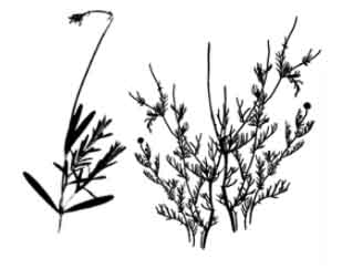
I then found a stock scientific illustration of a chamomile flower and did a little shameless referencing (and I’ll admit, a bit of tracing) to get the stocks just right. I also scanned some herbs from my garden outside and played with the levels until I could get a nice silhouette. Here’s what that ended up looking like:
You might ask why I chose to make the flower heads separate from the stocks. There’s a two part answer to that. The first is that if they were together, I would have to individually go in and change the color of each flower head, since you can only draw in a single color when you define a brush. So if 90% of the brush is green, I might as well draw it as green, then change the additional 10% to white. This is of course doable to go in and change the color, but it makes more work than I’d care to have. So by making the flower heads separate, I only need to pop the white flower heads where I please. Once I define the flower head brush to be a specific scatter, placing flower heads is no harder than drawing a line across the paper. The second reason is that I can use the stocks without the flowers as weeds or otherwise in any additional pictures I create that I need greenery in. Variation is often key in a lot of nature landscapes, so having an additional brush in my arsenal works out just great for future projects. I also plan on making a forest/meadow photoshop brush for people to download in the future. I’m just building it up right now.
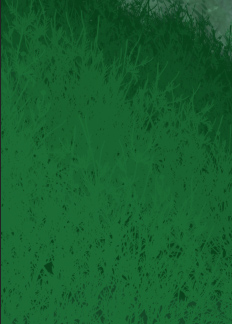
Now that I have the brushes defined, and my parameters set for the brushes, I draw out a few different layers of green. I try to vary it, but generally keep it so it isn’t too varied. I was aiming for simplicity with this one, so I limited my layers to four different greens, which seemed just bushy enough.
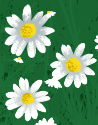
From there I had to do a little work. I started randomly placing my flower heads and making sure they didn’t look too much like a pattern. I also varied the size to give perspective, making them larger near the viewer. After that, I had to move flower heads to make sure none were just randomly floating there, or there weren’t any awkward ones not quite on a stock. Once that was done, I locked my transparency on the layers with the largest flower heads, and drew in every yellow cone by hand. Not so bad when there’s only a corner of an image to do it with.
From there, I shaded every larger flower head with a textural brush, since those were the only ones that would be visible.
A few more things here and there, some color correction, and voila! A finished piece.